BRANDING & PACKAGING
Client: Marylia Scott Cosmetics
Programs used: Illustrator
Year: 2019
The driving force behind this logo is to use the eye as a symbol that speaks to the consumer's unique idea of beauty.
The beams of light circling the eye emphasize shine, glimmer, and rejuvenation. We built the type to fit the circular structure.
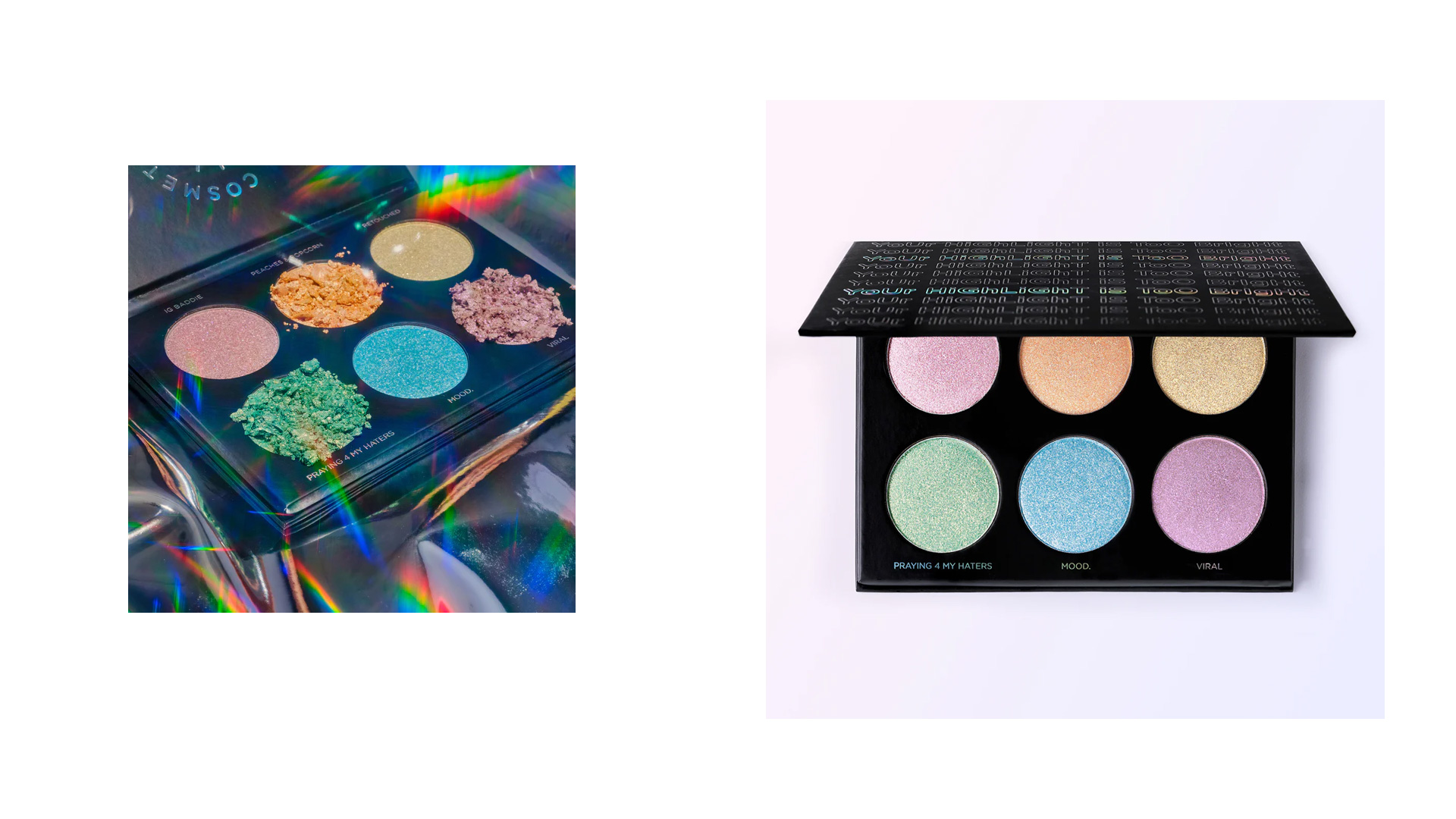
The packaging design for Marylia Scott Cosmetic’s highlighter palette was
inspired by Marylia’s radiant highlighters that reflect bright and iridescent tones.